Gabriel Erion, Alex Okeson, Jose Mario Pineda
Anesthesia equipment and monitor usage mistakes are cited as significant sources of error in the provision of major surgical care. However, no standardized guidelines exist for the efficient display of vitals information in the operating room. We attempted to help increase anesthesiologist performance in the operating room by creating a new, interactive interface that displays more data and uses interactive visualizations. We interviewed and observed two University of Washington anesthesiologists to learn current practices and determine advantages and deficits in the current system. We redesigned the anesthesiology operating room interface to include display customizability, trend visualization, exploration of historical vitals measurements, and calculation of vitals statistics not available in the existing vitals display. Our design aims to improve how quickly anesthesiologists can retrieve relevant information compared to the current interface.
Here is a mock up of the vital sign monitor used in the University of Washington hospital system as seen during our surgical observation (for comparison):
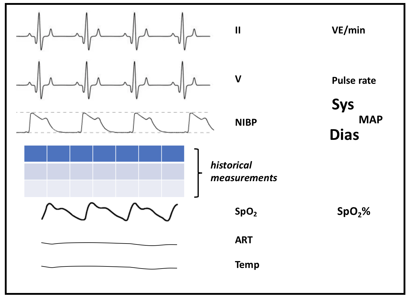
The left side of the screen shows real-time vital signs in 6 rows: EKG lead II, EKG lead V5, blood pressure cuff (NIBP), pulse oygen (SpO2), arterial pressure (ART), and temperature. Blood pressure cuff is in tabular form because it is measured every 3 minutes, with 4 past measurements shown. The other measurements are shown as line plots over the past 10 seconds. This also means that blood pressure is the only measurement for which any sort of history beyond 10 seconds is visible on the vitals display (along with pulse, which is also displayed in the table). An interesting (and ubiquitous) design choice in displaying real-time vital signs is that the data do not scroll as more time points come in; instead, the existing measurements are overwritten, with the current time point shown as a break in the line plot.
The right side of the screen contains labels for the time series, as well as 1 to 5 extra pieces of information per vital sign, all lined up next to their relevant time series: for example, next to the "ECG" row are "ST" (indicating ST segment elevation) and "VE/min" (indicating minute ventilation), as well as a "II" indicating that this is lead II. We counted about 21 separate numbers, sometimes unlabeled, on the right side of the screen.